OB1 App Feedback - Nits - Suggestions

  • HTML tutorial

Michael

Rank IX
Staff member
Founder 500
Member

Benefactor

15,584
Auburn, California, United States
First Name
Michael
Last Name
Murguia
Member #

0000

Ham/GMRS Callsign
KM6YSL
Hi Michael,

When performing a search in messaging section, I noticed some of the members are not showing up in the search results. Also, over the last few years I have directed folks to reach out to me on the OB app by looking up my OB ID. I realize now that I have not received very many responses. Could this be due to an issue with the search function (or do folks just think I'm weird and are avoiding me lol)?
Hi John - here are a couple ways to search for a user in OB1 - it also works for Member Number. Please let me know if you find this not to be working - or if we can improve the features to be easier. Also - can you let me know a member that did not show up so I can diagnose?

Thank you!

M

View attachment Image from iOS.mov
 

jcgraves3

NorthWest Region Member Rep's Portland OR
Member
Investor

Influencer I

3,156
Crescent City, Putnam County, Florida, United States
First Name
John
Last Name
Graves
Member #

20803

Ham/GMRS Callsign
KJ7RJJ
Hi Michael,

When performing a search in messaging section, I noticed some of the members are not showing up in the search results. Also, over the last few years I have directed folks to reach out to me on the OB app by looking up my OB ID. I realize now that I have not received very many responses. Could this be due to an issue with the search function (or do folks just think I'm weird and are avoiding me lol)?
Hi John - here are a couple ways to search for a user in OB1 - it also works for Member Number. Please let me know if you find this not to be working - or if we can improve the features to be easier. Also - can you let me know a member that did not show up so I can diagnose?

Thank you!

M

View attachment 241240
Ok, yes this worked, but it took me a moment to find the 'People' button. I had to click the spyglass icon to reveal, which was unexpected. I thought the spyglass was used to just execute the search criteria entered, my mistake. My approach was from the top right drop-down 'Messages' link. Maybe the 'People' button could also show up there?
 

Michael

Rank IX
Staff member
Founder 500
Member

Benefactor

15,584
Auburn, California, United States
First Name
Michael
Last Name
Murguia
Member #

0000

Ham/GMRS Callsign
KM6YSL
Ok, yes this worked, but it took me a moment to find the 'People' button. I had to click the spyglass icon to reveal, which was unexpected. I thought the spyglass was used to just execute the search criteria entered, my mistake. My approach was from the top right drop-down 'Messages' link. Maybe the 'People' button could also show up there?
Maybe it can work similar to the map. If you click in the search field, you will see selection buttons: Messages and People.
 

trail_runn4r

US Rocky Mtn. Local Expert. Colorado: Denver Area
Member

Pathfinder III

4,815
Denver, CO, USA
First Name
Carlo
Last Name
Donzelli
Member #

16845

Feedback! Bring it!
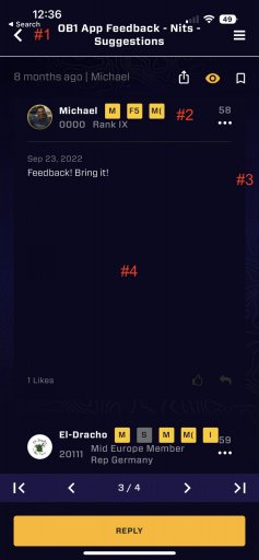
I have some suggestions to improve the UI of the forum section, refer to the screenshot below:
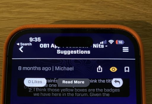
  1. there seems to be some issues with the navigation bar, you can't see on this screenshot but part of the title is hidden by the camera cutout. My guess is the positioning of the navigation bar is not respecting the safe layout area constraints on iOS. Also I think the title can be one line only
  2. I think those yellow boxes are the badges we have here in the forum. Given the space limitations the label are cut off. I'm not sure they provide any value in this form. I think on mobile having the avatar, username and OB number is enough information. This could be reduced in one line so save some space
  3. I'm not really a fan of this layout. The main content (blue background) has already some padding all the way around it. Having a padding to the padding just creates less space for the actual content, and on these small screen every pixel counts
  4. This is probably the biggest issue. It seems that the text view doesn't size automatically based on the size of the message, wasting a huge amount of space
 

Attachments

  • Like
Reactions: Ubiety

Michael

Rank IX
Staff member
Founder 500
Member

Benefactor

15,584
Auburn, California, United States
First Name
Michael
Last Name
Murguia
Member #

0000

Ham/GMRS Callsign
KM6YSL
I have some suggestions to improve the UI of the forum section, refer to the screenshot below:
  1. there seems to be some issues with the navigation bar, you can't see on this screenshot but part of the title is hidden by the camera cutout. My guess is the positioning of the navigation bar is not respecting the safe layout area constraints on iOS. Also I think the title can be one line only
  2. I think those yellow boxes are the badges we have here in the forum. Given the space limitations the label are cut off. I'm not sure they provide any value in this form. I think on mobile having the avatar, username and OB number is enough information. This could be reduced in one line so save some space
  3. I'm not really a fan of this layout. The main content (blue background) has already some padding all the way around it. Having a padding to the padding just creates less space for the actual content, and on these small screen every pixel counts
  4. This is probably the biggest issue. It seems that the text view doesn't size automatically based on the size of the message, wasting a huge amount of space
Thank you so much for this! Awesome. Follow ups:
1. What iOS phone do you have? We will test on that model and reproduce the issue.
2. The labels are member groups - those are correctly not displaying correctly in the live version of the app, but will be fixed on next release.
3. Copy
4. This is a hairball, known issue. Having all content boxes the same size is a necessary evil right now, and when we upgrade this, it will also get rid of the need for the "read more" button - it will just show it with a container of the proper size.

Thank you for all these notes!
 

trail_runn4r

US Rocky Mtn. Local Expert. Colorado: Denver Area
Member

Pathfinder III

4,815
Denver, CO, USA
First Name
Carlo
Last Name
Donzelli
Member #

16845

Thank you so much for this! Awesome. Follow ups:
1. What iOS phone do you have? We will test on that model and reproduce the issue.
2. The labels are member groups - those are correctly not displaying correctly in the live version of the app, but will be fixed on next release.
3. Copy
4. This is a hairball, known issue. Having all content boxes the same size is a necessary evil right now, and when we upgrade this, it will also get rid of the need for the "read more" button - it will just show it with a container of the proper size.

Thank you for all these notes!
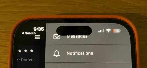
iPhone 14 Pro, screens attached.

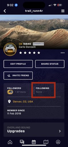
also another issue, under my profile the people I follow aren’t displayed, screen attached.
 

Attachments

  • Like
Reactions: Michael and Ubiety

El-Dracho

Ambassador, Europe
Moderator
Member
Supporter
Investor

Off-Road Ranger III

13,288
Lampertheim, Germany
First Name
Bjoern
Last Name
Eldracher
Member #

20111

Ham/GMRS Callsign
DO3BE
  1. there seems to be some issues with the navigation bar, you can't see on this screenshot but part of the title is hidden by the camera cutout. My guess is the positioning of the navigation bar is not respecting the safe layout area constraints on iOS. Also I think the title can be one line only
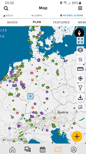
@Michael there is another similar case but within the app screen. On the right side we have the menu with the icons. The compass rose in the right upper corner is overlaid by the icon for the full screen mode. You can see it in the attached screenshot. Maybe this is device dependent? I have a Samsung Xcover 4s, with Android version 11.

Screenshot_20220924-095027_Overland Bound One.jpg
 
  • Like
Reactions: Michael and Ubiety

XC70_OVERLANDER

Local Expert Northern Germany
Member

Navigator II

12,559
Hamburg, Germany
First Name
Thore
Last Name
Fahrenbach
Member #

40915

Service Branch
Higher Education
Awesome new features. Is there a chance of converting miles into kilometres? That would be awesome.
 
  • Like
Reactions: Michael

XC70_OVERLANDER

Local Expert Northern Germany
Member

Navigator II

12,559
Hamburg, Germany
First Name
Thore
Last Name
Fahrenbach
Member #

40915

Service Branch
Higher Education
  1. there seems to be some issues with the navigation bar, you can't see on this screenshot but part of the title is hidden by the camera cutout. My guess is the positioning of the navigation bar is not respecting the safe layout area constraints on iOS. Also I think the title can be one line only
@Michael there is another similar case but within the app screen. On the right side we have the menu with the icons. The compass rose in the right upper corner is overlaid by the icon for the full screen mode. You can see it in the attached screenshot. Maybe this is device dependent? I have a Samsung Xcover 4s, with Android version 11.

View attachment 241277
On an iPhone (11 pro) this isn't a problem at all.
 

Attachments

El-Dracho

Ambassador, Europe
Moderator
Member
Supporter
Investor

Off-Road Ranger III

13,288
Lampertheim, Germany
First Name
Bjoern
Last Name
Eldracher
Member #

20111

Ham/GMRS Callsign
DO3BE
On an iPhone (11 pro) this isn't a problem at all.
I just checked this also with my Samsung 10'' tablet. With that there isn´t a problem at all. I guess it has something to do with the size of the display of the device?!

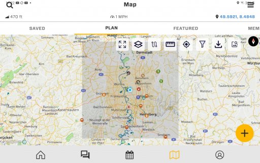
With the tablet I encounter a similar issue mentioned by @trail_runn4r under #1 before. The header of the OB1 app in map mode which contains the magnifying glass for the search, the word map and the menu on the right covers the top status toolbar of the tablet/ android this is only the case on the map tab. See attached please.
 

Attachments

  • Like
Reactions: Michael

Michael

Rank IX
Staff member
Founder 500
Member

Benefactor

15,584
Auburn, California, United States
First Name
Michael
Last Name
Murguia
Member #

0000

Ham/GMRS Callsign
KM6YSL
I just checked this also with my Samsung 10'' tablet. With that there isn´t a problem at all. I guess it has something to do with the size of the display of the device?!

With the tablet I encounter a similar issue mentioned by @trail_runn4r under #1 before. The header of the OB1 app in map mode which contains the magnifying glass for the search, the word map and the menu on the right covers the top status toolbar of the tablet/ android this is only the case on the map tab. See attached please.
Got this captured - we will address layout!
 
  • Like
Reactions: El-Dracho

El-Dracho

Ambassador, Europe
Moderator
Member
Supporter
Investor

Off-Road Ranger III

13,288
Lampertheim, Germany
First Name
Bjoern
Last Name
Eldracher
Member #

20111

Ham/GMRS Callsign
DO3BE
I just checked this also with my Samsung 10'' tablet. With that there isn´t a problem at all. I guess it has something to do with the size of the display of the device?!

With the tablet I encounter a similar issue mentioned by @trail_runn4r under #1 before. The header of the OB1 app in map mode which contains the magnifying glass for the search, the word map and the menu on the right covers the top status toolbar of the tablet/ android this is only the case on the map tab. See attached please.
Got this captured - we will address layout!
Thank you!
 
  • Like
Reactions: Michael

XC70_OVERLANDER

Local Expert Northern Germany
Member

Navigator II

12,559
Hamburg, Germany
First Name
Thore
Last Name
Fahrenbach
Member #

40915

Service Branch
Higher Education
@El-Dracho and I were thinking about the idea to create a new region for online meet-ups. The reason behind this idea is that many people filter the events for their own region and will miss Blume meet-ups.

For example the „midEurope Virtual Bonfire“ we would love that people form all over the world could join. And the other way around to. I blocked the us events just to have a better overview about what is happening in Europe wich let’s me miss all the online events.

Would that be a good idea?
 

Michael

Rank IX
Staff member
Founder 500
Member

Benefactor

15,584
Auburn, California, United States
First Name
Michael
Last Name
Murguia
Member #

0000

Ham/GMRS Callsign
KM6YSL
@El-Dracho and I were thinking about the idea to create a new region for online meet-ups. The reason behind this idea is that many people filter the events for their own region and will miss Blume meet-ups.

For example the „midEurope Virtual Bonfire“ we would love that people form all over the world could join. And the other way around to. I blocked the us events just to have a better overview about what is happening in Europe wich let’s me miss all the online events.

Would that be a good idea?
I like it - I will note this!
 

El-Dracho

Ambassador, Europe
Moderator
Member
Supporter
Investor

Off-Road Ranger III

13,288
Lampertheim, Germany
First Name
Bjoern
Last Name
Eldracher
Member #

20111

Ham/GMRS Callsign
DO3BE
I like it - I will note this!

Thank you. That's awesome. It would be great if the online meetups were attended by members regardless of the region in which they are based. With a separate region we could promote that and I think we can bring people together even better.
 

reaver

Rank VI
Member

Explorer I

3,680
Caldwell, ID, USA
First Name
Brian
Last Name
McGahuey
Member #

23711

Ham/GMRS Callsign
GMRS WRMV941
Man, I really want to like the app, but I find it very counter intuitive. I'm sure it'll get there at some point, but at the moment, I find it unusable.

My biggest issue is I can't seem to find a way to just import a gpx track, without attaching it to a rally point (which I don't want to do for a trip where we already have our crew), or a location (which I can't seem to get working either). It would be really nice if we could just click the (+) button, and import a GPX track that way, instead of having some convoluted process that requires 50 steps.

My other big complaint is there's no way to categorize and organize my routes into groups. For example, in Gaia, you can create folders, and assign routes/tracks/POI's a folder. That way, you can turn off items on the map that you don't need.

Similar features exist in both OnX and Caltopo. I feel like we desperately need something similar in OB1.

Sorry, I've been fighting with the app for a few hours now, and I fear my frustration may have show a bit more than intended here.
 

Michael

Rank IX
Staff member
Founder 500
Member

Benefactor

15,584
Auburn, California, United States
First Name
Michael
Last Name
Murguia
Member #

0000

Ham/GMRS Callsign
KM6YSL
Man, I really want to like the app, but I find it very counter intuitive. I'm sure it'll get there at some point, but at the moment, I find it unusable.

My biggest issue is I can't seem to find a way to just import a gpx track, without attaching it to a rally point (which I don't want to do for a trip where we already have our crew), or a location (which I can't seem to get working either). It would be really nice if we could just click the (+) button, and import a GPX track that way, instead of having some convoluted process that requires 50 steps.

My other big complaint is there's no way to categorize and organize my routes into groups. For example, in Gaia, you can create folders, and assign routes/tracks/POI's a folder. That way, you can turn off items on the map that you don't need.

Similar features exist in both OnX and Caltopo. I feel like we desperately need something similar in OB1.

Sorry, I've been fighting with the app for a few hours now, and I fear my frustration may have show a bit more than intended here.
Don't worry about expressing frustration! The most important thing is that the app work well, and is intuitive.

As of build 11.12.0 you can hit the "+" button and import GPX. Did that just for you :) Please let me know if that works as you would expect. If you tap a GPX anywhere on the phone (like in an email, or txt, or files) it should prompt to open in OB1, but now you also have the "+" button as well.

Organizing routes - that is something we are working on - it will be a bit, but get it in. I appreciate getting the feedback very much, and I will act on it for you! Please let me know any other suggestions you might have.

Thank you!

M
 

reaver

Rank VI
Member

Explorer I

3,680
Caldwell, ID, USA
First Name
Brian
Last Name
McGahuey
Member #

23711

Ham/GMRS Callsign
GMRS WRMV941
Don't worry about expressing frustration! The most important thing is that the app work well, and is intuitive.

As of build 11.12.0 you can hit the "+" button and import GPX. Did that just for you :) Please let me know if that works as you would expect. If you tap a GPX anywhere on the phone (like in an email, or txt, or files) it should prompt to open in OB1, but now you also have the "+" button as well.

Organizing routes - that is something we are working on - it will be a bit, but get it in. I appreciate getting the feedback very much, and I will act on it for you! Please let me know any other suggestions you might have.

Thank you!

M
Awesome! Thanks Michael! Now, how do I gain access to this build so that I can try it out over the weekend? :grinning: