@Michael
Your welcome. Let me know if the detail level becomes burdensome or if I should just pipe down. :D
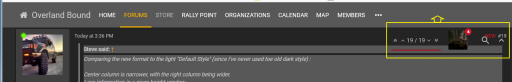
The 100ms delay has resolved the errant popping up of the sub menus, though now it seems a bit slow maybe 50ms or 75ms would feel right. Not sure if I'm the only one seeing this. The menus getting stuck down still seems to happen.
Liking the smaller side bar, and that the side bar seems to start in collapsed mode now.
Am seeing a new issue. Sometimes when I scroll down the "Post Depth" widget, My avatar w/ notification bubble and the search icon creep down out of the header. Not happening now but I'll see if I can get a screen shot next time I see it.
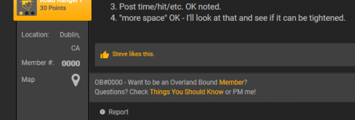
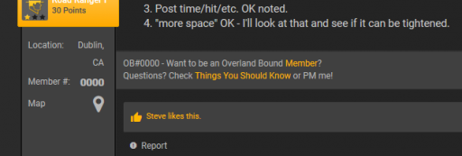
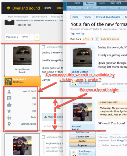
Would it be possible to alter the placement between the "Likes" and the OP's signature? Right now the Likes appear between the Post and Sig. It would be preferred to keep the Sig with the post for clarity. Maybe include the Report, Like & Reply in the same shaded area. Here is an example from your post above just reordering the boxes:
Something like this:
I actually think Steve's point here is a feature. There are some Sigs with large pics that while awesome once you enter a thread where that person posted a number of times it makes it easy to get lost in the thread when seeing the same large Sig over and over. The Click to expand feature makes threads much easier to read.
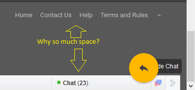
As I'm writing this I'm noticing that the Edit tool bat is scrolling off the top of the screen making it harder to change indent/text formatting in this post. Not sure if you can freeze that within the reply box like the main OB header but that would be a nice Usability add if the team can pull it off.
I also have some ideas for printable view (IE: a printable theme where you can specify # of posts to load, and an [X] to remove unwanted posts / Sigs etc... Makes taking some technical procedures that have been posted out to the shop MUCH easier.)
Boort