New "Official" OLB Forum Theme

  • HTML tutorial

Which Theme do you prefer?

  • OLB Dark Official

    Votes: 18 35.3%
  • OLB Dark Responsive

    Votes: 29 56.9%
  • Default Style

    Votes: 4 7.8%

  • Total voters
    51

Michael

Rank IX
Staff member
Founder 500
Member

Benefactor

15,584
Livermore, California, United States
First Name
Michael
Last Name
Murguia
Member #

0000

Ham/GMRS Callsign
KM6YSL
Hi everyone,

I would like to get your feedback on a new theme and style for the forums. We will be making this new theme the default theme soon. You will still be able to use the current theme, or the default theme. We take usability and readability seriously, and this has gone through quite a bit of iteration, but it needs your input!

Why are we updating?
  1. We are rebuilding the Mobile Apps and this theme is compatible
  2. Better responsive design
  3. More readable and usable interface
  4. Additional features to expand with our community
I'd love to hear of any usability issues you have or any suggestions for better visibility. The theme remains dark, since we received the feedback on multiple occasions that our members are reading the forums at night while exploring epic locations :)

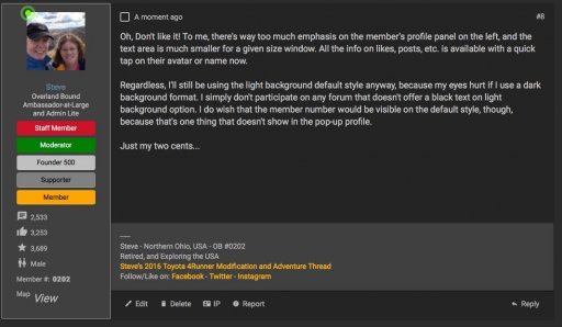
To try out the new theme, go to the bottom of this page and you will see the currently selected theme. Tap the theme name, and change it to "OLB Dark Responsive Official". If you prefer a light theme, choose "Default Style".

This is a bit off topic here, so this thread will find its way to the "Off Topic" or "Behind the Scenes" forum in a few days.

As always, thank you for the support!

Michael
 

GoXplore

Rank V
Launch Member

Enthusiast III

1,751
Nashville, TN
First Name
David
Last Name
Yancy
Member #

8203

Ham/GMRS Callsign
W4DKY
Much respect for what you're attempting, Michael. I operate several forums one of which has approximately 30,000 members, and no matter what I change with the style to improve the sites, I am never able to please everyone. My intake of bourbon increases noticeably when I am working on things like this. :hushed:
 

Jeff Graham

Rank VI
Launch Member

Benefactor

4,551
Splendora, TX, USA
First Name
Jeff
Last Name
Graham
Member #

5888

Service Branch
Army Vet
My impressions of OLB Dark Responsive official: it's generally is very good. I have just a few negs: I prefer the square vs the round Avatar window, the badges are hard to recognize, and the light field around the likes in each post is a bit out of place (with the general dark theme). I do like how crisp everything looks. It is very clean looking. Writing this post, as my wife takes a turn at the wheel, heading to a state park. The dark nature of the theme is nice in the dark car.
 
  • Like
Reactions: Michael

Michael

Rank IX
Staff member
Founder 500
Member

Benefactor

15,584
Livermore, California, United States
First Name
Michael
Last Name
Murguia
Member #

0000

Ham/GMRS Callsign
KM6YSL
My impressions of OLB Dark Responsive official: it's generally is very good. I have just a few negs: I prefer the square vs the round Avatar window, the badges are hard to recognize, and the light field around the likes in each post is a bit out of place (with the general dark theme). I do like how crisp everything looks. It is very clean looking. Writing this post, as my wife takes a turn at the wheel, heading to a state park. The dark nature of the theme is nice in the dark car.
Great! Good feedback, and these changes I can make easily. I'll make these changes tonight!
 

Terry Pickens

Rank V
Launch Member

Off-Road Ranger I

2,771
Evansville, WY, USA
First Name
Terry
Last Name
Pickens
Member #

3062

Ham/GMRS Callsign
KJ7FTV
On the "dark responsive official" will there be icons for alerts and inbox notifications like the "dark responsive"?

Never mind I found them. I should search more before I question.
 
Last edited:
  • Like
Reactions: Michael

Steve

lost again...
Founder 500
Launch Member

Traveler III

4,312
Lorain County, OH, USA
First Name
Steve
Last Name
None
Member #

202

Oh, Don't like it! To me, there's way too much emphasis on the member's profile panel on the left, and the text area is much smaller for a given size window. All the info on likes, posts, etc. is available with a quick tap on their avatar or name now.

Regardless, I'll still be using the light background default style anyway, because my eyes hurt if I use a dark background format. I simply don't participate on any forum that doesn't offer a black text on light background option. I do wish that the member number would be visible on the default style, though, because that's one thing that doesn't show in the pop-up profile.

Just my two cents...

New _Official_ OLB Forum Theme | OVERLAND BOUND COMMUNITY-1.jpg

New _Official_ OLB Forum Theme | OVERLAND BOUND COMMUNITY.jpg
 
  • Like
Reactions: Michael

Jimmy P

Rank V
Launch Member

Off-Road Ranger I

1,415
Duncan, OK, USA
Member #

15768

Ham/GMRS Callsign
KG5JLP
I'll still be using the light background default style anyway, because my eyes hurt if I use a dark background format.
I agree with this...I prefer black text on a white background. I stare at a screen all day, and there's just something about white text on a dark background that bugs my eyes out. Beyond that, I do like the new theme :smile:
 
  • Like
Reactions: Michael

Kent R

Executive Director
Staff member
Mod Team
Moderator
Member

Pathfinder III

5,200
El Dorado, Ca
First Name
Kent
Last Name
Reynolds
Member #

1632

Ham/GMRS Callsign
K6KNT
Service Branch
Retired Firefighter
I like the default style
 
  • Like
Reactions: Michael

Winterpeg

CDN Prairie Ambassador
Staff member
Launch Member

Influencer II

3,278
Winnipeg, MB
Member #

2861

I like the fact that the floating bar is gone, that made it tough to zoom in and click on a mobile device.
The mobile chat and top of page arrow is pretty big though.
 
  • Like
Reactions: Michael

HoneyBadgerXJ

Rank V
Launch Member

Enthusiast III

1,978
Irvine, CA, USA
First Name
Joey
Last Name
Treadwell
Member #

2396

It's a hard pick for me between the Dark Responsive and Dark Responsive Official. They both have their own advantages, but I like Official better I think. It really pops out at you and I really like that it's still dark. I also like the thread controls on the top.