Feedback Requested: Making Map Tabs and Info more useful

  • HTML tutorial

Michael

Rank IX
Staff member
Founder 500
Member

Benefactor

15,584
Auburn, California, United States
First Name
Michael
Last Name
Murguia
Member #

0000

Ham/GMRS Callsign
KM6YSL
I will posit the current map tabs functionality are confusing and information is cluttered. We are therefore beating up various alternatives. Here is a version of the map tabs I'll put forth to tear apart and get new ideas.

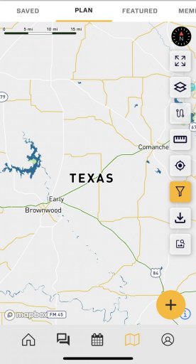
These tabs are the subject:
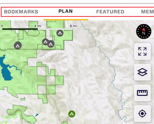
1663973287646.png
...and this is said clutter:
1663973331477.png

This proposal is an attempt to provide information where you need it, make it less confusing, and declutter for basic map use. Proposed new tabs:
  • Main Map: This is where users land by default. No POI are visible on this map when you first see it at a low zoom, but they are there when you zoom in at a much higher zoom level. This declutters the map, but shows POI at zoom levels that are useful, like the driving follow mode.
  • Resources: It has all POI icons and everything else. This is no longer the default map tab. The “Resources” tab also has "Markers" (Gaia Waypoint equivalent), but Markers only show at a much higher zoom level.
  • Members
  • Events
  • Following This has resources created by anyone you are following, including Patreon people you may have subscribed to, to unlock Patreon content in OB1.
Note: The "Saved" aka "Bookmark" tab goes away. You can still bookmark Resources, but they would appear on the Main Map at any zoom level, and this is how you see them at all times. The though is - simplify, and reduce map tabs if possible.

Would love to get your feedback or other ideas. Is this a fail? Does it sound good?
 

K12

Rank VII
Member

Pathfinder I

5,863
Idaho, United States
First Name
Beau
Last Name
K12
Member #

28559

Service Branch
Air Force
I will posit the current map tabs functionality are confusing and information is cluttered. We are therefore beating up various alternatives. Here is a version of the map tabs I'll put forth to tear apart and get new ideas.

These tabs are the subject:
View attachment 241264
...and this is said clutter:
View attachment 241265

This proposal is an attempt to provide information where you need it, make it less confusing, and declutter for basic map use. Proposed new tabs:
  • Main Map: This is where users land by default. No POI are visible on this map when you first see it at a low zoom, but they are there when you zoom in at a much higher zoom level. This declutters the map, but shows POI at zoom levels that are useful, like the driving follow mode.
  • Resources: It has all POI icons and everything else. This is no longer the default map tab. The “Resources” tab also has "Markers" (Gaia Waypoint equivalent), but Markers only show at a much higher zoom level.
  • Members
  • Events
  • Following This has resources created by anyone you are following, including Patreon people you may have subscribed to, to unlock Patreon content in OB1.
Note: The "Saved" aka "Bookmark" tab goes away. You can still bookmark Resources, but they would appear on the Main Map at any zoom level, and this is how you see them at all times. The though is - simplify, and reduce map tabs if possible.

Would love to get your feedback or other ideas. Is this a fail? Does it sound good?
In the interest of saving tabs, could the members and following be combined into one tab. with following being a different color and filters to turn either on or off? this may not be a popular option, but tossing it out to see how many would agree.
 

Ubiety

Rank VI
Member

Explorer I

5,221
Sammamish, WA, USA
First Name
Greg
Last Name
Ubiety
Member #

6193

Ham/GMRS Callsign
Ribs
I wonder if all of the map tabs are necessary - possibly some kind of "picker" control that would change the functionality of the map rather than a bunch of tabs? My current install of OB1 has (at least) "Saved" and "Plan" - I have often wondered where "Navigate" is? What tab am I meant to navigate with? I am not asking for a Navigate tab, rather I think a simplified UI would be better. Currently I use the Plan tab 99% of the time and as such I am training myself to not pay attention to the others. Or possibly a re-ordering of the map tabs? It would be great if the "most used" tabs were visible and other, less used, tabs were the ones that required scrolling of the map tabs. For instance I would rather have quicker access to Events than Members; I would rather have Plan/Navigate come before Saved or Featured. Not sure that I would ever use Featured; don't know, there is nothing featured in my area so this tab is currently meaningless to me and I'd rather see Events take its place of prominence.

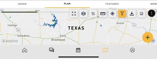
Also the map tabs have a less efficient use of screen real estate when in landscape mode. The spacing on the tabs looks just about right in portrait (maybe a tad too wide), but are really wide in landscape. Would be nice to shrink the spacing in landscape, at least, so more tabs are visible.
IMG_7470.jpeg IMG_7471.jpeg
 

El-Dracho

Ambassador, Europe
Moderator
Member
Supporter
Investor

Off-Road Ranger III

13,288
Lampertheim, Germany
First Name
Bjoern
Last Name
Eldracher
Member #

20111

Ham/GMRS Callsign
DO3BE
The clearer design of the different map tabs is a good idea. I support that very much. I have similar thoughts to those of @Ubiety.

Do we even need different maps/tabs? I use the plan map most of the time. So how about reducing everything to one map and then controlling the display of the icons depending on the zoom level as already mentioned. In addition, a possibility to put a filter on it like we ave already in the plan map view. This simplifies the map and it is easier to keep the overview. Would this be a good idea?
 

Michael

Rank IX
Staff member
Founder 500
Member

Benefactor

15,584
Auburn, California, United States
First Name
Michael
Last Name
Murguia
Member #

0000

Ham/GMRS Callsign
KM6YSL
I am reading your feedback and also refining my tab organization - then will respond to "no map tabs". Refined thinking (These tabs would be left to right):
  • Main Map: This is where users land by default. No POI are visible on this map when you first see it at a low zoom, but they are there when you zoom in at a much higher zoom level. This declutters the map, but shows POI at zoom levels that are useful, like the driving follow mode.
  • Resources: It has all POI icons and everything else. This is no longer the default map tab. The “Resources” tab also has "Markers" (Gaia Waypoint equivalent), but Markers only show at a much higher zoom level.
  • Bookmarks - Displays bookmarked content.
  • Events - Current Events tab.
  • Members - Current Member Tab
  • Following This has resources created by anyone you are following

Some questions about this:

- We could call the Main Map tab, "Navigate" and when they first land on the Navigate tab, tell them, "Bookmarked content will appear on this map at all zoom levels", and get rid of the Bookmarked tab. This might be a very bad idea.

No tabs solution:

HOW WOULD WE EVEN DO THIS GUUUUYS?! :tearsofjoy:


OK, OK - listing some of the factors to overcome:
  • Both the Filters, and the Create buttons are context sensitive. They do different things depending on the mode or tab you are on.
  • Sheer volume of stuff on the map if it is all one.
  • How to display, easily, the various map tab categories on one map. If we use buttons for filters, you are basically back to map tabs.
Does anyone have a one paragraph pitch I can wrap my brain around. How do we do it?
 

K12

Rank VII
Member

Pathfinder I

5,863
Idaho, United States
First Name
Beau
Last Name
K12
Member #

28559

Service Branch
Air Force
I am reading your feedback and also refining my tab organization - then will respond to "no map tabs". Refined thinking (These tabs would be left to right):
  • Main Map: This is where users land by default. No POI are visible on this map when you first see it at a low zoom, but they are there when you zoom in at a much higher zoom level. This declutters the map, but shows POI at zoom levels that are useful, like the driving follow mode.
  • Resources: It has all POI icons and everything else. This is no longer the default map tab. The “Resources” tab also has "Markers" (Gaia Waypoint equivalent), but Markers only show at a much higher zoom level.
  • Bookmarks - Displays bookmarked content.
  • Events - Current Events tab.
  • Members - Current Member Tab
  • Following This has resources created by anyone you are following

Some questions about this:

- We could call the Main Map tab, "Navigate" and when they first land on the Navigate tab, tell them, "Bookmarked content will appear on this map at all zoom levels", and get rid of the Bookmarked tab. This might be a very bad idea.

No tabs solution:

HOW WOULD WE EVEN DO THIS GUUUUYS?! :tearsofjoy:


OK, OK - listing some of the factors to overcome:
  • Both the Filters, and the Create buttons are context sensitive. They do different things depending on the mode or tab you are on.
  • Sheer volume of stuff on the map if it is all one.
  • How to display, easily, the various map tab categories on one map. If we use buttons for filters, you are basically back to map tabs.
Does anyone have a one paragraph pitch I can wrap my brain around. How do we do it?
You make a valid point on the single map problem. I did consider filter tabs (similar to how OnX does it with layers) this might be the only way to do it efficiently and still will give everyone what they want as ling as chosen filters stick between shutdown and startup. Everyone could tailor their layers (tabs) on a single map how they want
 

OTH Overland

Local Expert Washington, USA
Member
Investor

Trail Blazer III

4,847
Camano Island, WA, USA
First Name
Dave
Last Name
Ballard
Member #

20527

Ham/GMRS Callsign
N7XQP
Service Branch
Fire/EMS/SAR
I like simple and customizable, I am either in planning mode where I want lots of stuff turned on and a high level of detail as I am working on a PC or Laptop to get enough screen to see the big picture, or I am in travel mode where I am bouncing down some trail and I just want a super clear picture of what is coming up so I know which way to turn at the next intersection or when my next 'epic' campsite, lunch stop or cool feature is coming up. As everyone's opinion of what should or should not be on a map is different, it would be nice perhaps to have one main map (tab?) that opens by default with everything available on it, but with a detailed set of filters to turn off the various categories you do not want. Then an option to duplicate the tab, name it as you see fit and set a different bunch of filters, that way you can have one tab or many, up to the user. Personally I do not want separate tabs for Resources, Bookmarks, Events, Members etc. I do not use any one of these enough to warrant its own tab, I would far prefer to hit a settings button, enable that feature, look up what I need, then turn it back off.

A one touch zoom button to allow a quick zoom in on your postion while driving to see intersections and then back out to your previous zoom setting without having to use the pinch to zoom would be a bonus.

My biggest pet peeve with nav software in general is when traveling and I see some tiny little symbol on the map ahead (for example a waterfall icon) and zoom in to see what it is, and the symbol and text do not get any bigger as you zoom in. Would be awesome to have a text size scale factor or scale with zoom override to allow text and icons to increase in size as you zoom in.
 

Ubiety

Rank VI
Member

Explorer I

5,221
Sammamish, WA, USA
First Name
Greg
Last Name
Ubiety
Member #

6193

Ham/GMRS Callsign
Ribs
I like simple and customizable, I am either in planning mode where I want lots of stuff turned on and a high level of detail as I am working on a PC or Laptop to get enough screen to see the big picture, or I am in travel mode where I am bouncing down some trail and I just want a super clear picture of what is coming up so I know which way to turn at the next intersection or when my next 'epic' campsite, lunch stop or cool feature is coming up. As everyone's opinion of what should or should not be on a map is different, it would be nice perhaps to have one main map (tab?) that opens by default with everything available on it, but with a detailed set of filters to turn off the various categories you do not want. Then an option to duplicate the tab, name it as you see fit and set a different bunch of filters, that way you can have one tab or many, up to the user. Personally I do not want separate tabs for Resources, Bookmarks, Events, Members etc. I do not use any one of these enough to warrant its own tab, I would far prefer to hit a settings button, enable that feature, look up what I need, then turn it back off.

A one touch zoom button to allow a quick zoom in on your postion while driving to see intersections and then back out to your previous zoom setting without having to use the pinch to zoom would be a bonus.

My biggest pet peeve with nav software in general is when traveling and I see some tiny little symbol on the map ahead (for example a waterfall icon) and zoom in to see what it is, and the symbol and text do not get any bigger as you zoom in. Would be awesome to have a text size scale factor or scale with zoom override to allow text and icons to increase in size as you zoom in.
Agree with @OTH Overland's comments here. I'd rather see filtering take on the job of the different map tabs. Perhaps some "filter presets" - single click items that would set appropriate hardcoded set of filters that would emulate the Events tab, or the Members tab, etc. I think that the different map tabs are a bit confusing (e.g. my previous comment about which tab is the navigate tab?).

I would love to see the "one touch zoom" that OTH mentions; at least being able to zoom close and far. Close zoom for navigating, far zoom for getting the big picture. Possibly far zoom would be constrained by the bounds of the current route (is there a way to have a current route that you are following?). Would be even better if the user could set a custom zoom level and view type for each. For instance when viewing far I would like to see North up, 2D view, the entire track, not following my location - and when zooming close see following my location, track up and 3D view.

And scaling text/icons would be superb!!!
 

Michael

Rank IX
Staff member
Founder 500
Member

Benefactor

15,584
Auburn, California, United States
First Name
Michael
Last Name
Murguia
Member #

0000

Ham/GMRS Callsign
KM6YSL
it would be nice perhaps to have one main map (tab?) that opens by default with everything available on it, but with a detailed set of filters to turn off the various categories you do not want.
This is what we essentially have now with the plan tab by default. Keep in mind - you are probably a POWER user. The issue currently is that people open the map and they are scared out of their minds. We get the feedback all the time, "Whoa! too busy! I'm out!", and the other thing is - filters - that's too much for the casual user - "If i have to go to a filters menu - I'm out". So we are trying to find the best "first look" experience without over-whelming, while providing deeper functionality for power users.

My biggest pet peeve with nav software in general is when traveling and I see some tiny little symbol on the map ahead (for example a waterfall icon) and zoom in to see what it is, and the symbol and text do not get any bigger as you zoom in. Would be awesome to have a text size scale factor or scale with zoom override to allow text and icons to increase in size as you zoom in.
This one we can solve. Ours do in fact scale up - and we could increase that even more.
 

sebm

Rank VI
Member
Investor

Explorer I

3,360
San Jose, CA, USA
First Name
Seb
Last Name
Mess
Member #

21583

Ham/GMRS Callsign
KN6RUE
A few thoughts on this in no particular order:
  • Selecting for most viewed (most recently created, or some other metric) to show a reduced amount of clutter when there is more than X resources within X distance on the screen (bigger screens get more resources visible). An opt-in option would have "show me everything you've got" where this selectivity is disabled
  • There is definitely a need to see everything when planning, but also a need to show a limited set of resources when on a trip "along route" kind of option
    • tags for trips would be another option where if you open the map while on your trip you only see what you tagged for this trip. (and if you go back to that spot you already have those organized)
  • part of the visual clutter is the icons details as well. Since all the icons have unique (or could have unique) colors, reducing the icon to a colored dot (without the pictogram inside) would help visibility. Playing with overlapping circles with edges (or transparency) to give a perspective of density would be good.
    • think zillow.com and how i goes from the price to a red dot with white border as an example
  • I do think that a tab for a personal subset of resources (bookmarks, tag for trips, private resources, etc) is important because I am more likely to use ressources I've pre-selected
  • The map could also have an increased level of simplification for zoomed-out view.
    • smoothing jagged edges of the zones (blm for example)
    • more aggressive at hiding small streets
    • smoothing edges of rivers, lakes, etc
    • you get the idea
I think these would help with the clutter feeling.

Cheers!
 

Michael

Rank IX
Staff member
Founder 500
Member

Benefactor

15,584
Auburn, California, United States
First Name
Michael
Last Name
Murguia
Member #

0000

Ham/GMRS Callsign
KM6YSL
A few thoughts on this in no particular order:
  • Selecting for most viewed (most recently created, or some other metric) to show a reduced amount of clutter when there is more than X resources within X distance on the screen (bigger screens get more resources visible). An opt-in option would have "show me everything you've got" where this selectivity is disabled
  • There is definitely a need to see everything when planning, but also a need to show a limited set of resources when on a trip "along route" kind of option
    • tags for trips would be another option where if you open the map while on your trip you only see what you tagged for this trip. (and if you go back to that spot you already have those organized)
  • part of the visual clutter is the icons details as well. Since all the icons have unique (or could have unique) colors, reducing the icon to a colored dot (without the pictogram inside) would help visibility. Playing with overlapping circles with edges (or transparency) to give a perspective of density would be good.
    • think zillow.com and how i goes from the price to a red dot with white border as an example
  • I do think that a tab for a personal subset of resources (bookmarks, tag for trips, private resources, etc) is important because I am more likely to use ressources I've pre-selected
  • The map could also have an increased level of simplification for zoomed-out view.
    • smoothing jagged edges of the zones (blm for example)
    • more aggressive at hiding small streets
    • smoothing edges of rivers, lakes, etc
    • you get the idea
I think these would help with the clutter feeling.

Cheers!
Seb! Thank you for the awesome feedback! I’m going to parse thoroughly and reply as well.
 

Michael

Rank IX
Staff member
Founder 500
Member

Benefactor

15,584
Auburn, California, United States
First Name
Michael
Last Name
Murguia
Member #

0000

Ham/GMRS Callsign
KM6YSL
A few thoughts on this in no particular order:
  • Selecting for most viewed (most recently created, or some other metric) to show a reduced amount of clutter when there is more than X resources within X distance on the screen (bigger screens get more resources visible). An opt-in option would have "show me everything you've got" where this selectivity is disabled
  • There is definitely a need to see everything when planning, but also a need to show a limited set of resources when on a trip "along route" kind of option
    • tags for trips would be another option where if you open the map while on your trip you only see what you tagged for this trip. (and if you go back to that spot you already have those organized)
  • part of the visual clutter is the icons details as well. Since all the icons have unique (or could have unique) colors, reducing the icon to a colored dot (without the pictogram inside) would help visibility. Playing with overlapping circles with edges (or transparency) to give a perspective of density would be good.
    • think zillow.com and how i goes from the price to a red dot with white border as an example
  • I do think that a tab for a personal subset of resources (bookmarks, tag for trips, private resources, etc) is important because I am more likely to use ressources I've pre-selected
  • The map could also have an increased level of simplification for zoomed-out view.
    • smoothing jagged edges of the zones (blm for example)
    • more aggressive at hiding small streets
    • smoothing edges of rivers, lakes, etc
    • you get the idea
I think these would help with the clutter feeling.

Cheers!
Thank you for these notes - I'm considering as we evolve the map tab concept and various options.
 
  • Like
Reactions: sebm

Michael

Rank IX
Staff member
Founder 500
Member

Benefactor

15,584
Auburn, California, United States
First Name
Michael
Last Name
Murguia
Member #

0000

Ham/GMRS Callsign
KM6YSL
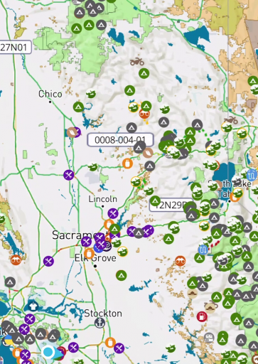
Something new to play with to get ya'lls feedback.

This is a heat map (green) that indicates POI density, and transitions into the poi icons higher zooms. Is there a place for this? Does it "declutter"? Burn it with fire?

 
  • Like
Reactions: El-Dracho

K12

Rank VII
Member

Pathfinder I

5,863
Idaho, United States
First Name
Beau
Last Name
K12
Member #

28559

Service Branch
Air Force
Something new to play with to get ya'lls feedback.

This is a heat map (green) that indicates POI density, and transitions into the poi icons higher zooms. Is there a place for this? Does it "declutter"? Burn it with fire?

I like that and makes it a bit easier to see things. Would this be an option thay can possibly be filtered (defaults to on, but option to turn off). IMO it does declutter the map and make it easier. Also highlights the areas with POIs that will make it easier for route mapping.
 

El-Dracho

Ambassador, Europe
Moderator
Member
Supporter
Investor

Off-Road Ranger III

13,288
Lampertheim, Germany
First Name
Bjoern
Last Name
Eldracher
Member #

20111

Ham/GMRS Callsign
DO3BE
Something new to play with to get ya'lls feedback.

This is a heat map (green) that indicates POI density, and transitions into the poi icons higher zooms. Is there a place for this? Does it "declutter"? Burn it with fire?

I like the idea. Would it also be an idea to display the same types of POIs as one icon and only several when you zoom in further? So, for example, if in a small area there are let´s say 20 campsites. What about showing in the higher zoom level only one icon then and the individual ones then pop up when zooming in?
 

El-Dracho

Ambassador, Europe
Moderator
Member
Supporter
Investor

Off-Road Ranger III

13,288
Lampertheim, Germany
First Name
Bjoern
Last Name
Eldracher
Member #

20111

Ham/GMRS Callsign
DO3BE
A few more thoughts about keeping the map clear and easy to use.

I understand that there are users who want a simple and easy to understand interface, while others, let's call them POWER users, want to see a lot of features, functions and details. Of course, one possibility would be to make a map tab completely customizable. But I think this is very complex, right? So, what about making two map tabs, one with the basic functions and one with all functions, so to say an expedition mode if you like?
 

Michael

Rank IX
Staff member
Founder 500
Member

Benefactor

15,584
Auburn, California, United States
First Name
Michael
Last Name
Murguia
Member #

0000

Ham/GMRS Callsign
KM6YSL
Something new to play with to get ya'lls feedback.

This is a heat map (green) that indicates POI density, and transitions into the poi icons higher zooms. Is there a place for this? Does it "declutter"? Burn it with fire?

I like the idea. Would it also be an idea to display the same types of POIs as one icon and only several when you zoom in further? So, for example, if in a small area there are let´s say 20 campsites. What about showing in the higher zoom level only one icon then and the individual ones then pop up when zooming in?
Yup, this is something to consider. Circle with a number perhaps.
 
  • Like
Reactions: El-Dracho

zgfiredude

Rank VI

Steward I

3,953
Silt, CO, USA
First Name
Brian
Last Name
Nichols
Member #

28938

Service Branch
Firefighter
It seems like we are bouncing back and forth between mapping and marketing a bit. I fully understand the desire to display some/a lot/all of the resources available from a marketing standpoint. It does however create this discussion of how to make the mapping use easier/more user friendly/and perhaps customizable. Secondarily to the above balancing act, we have screen size/form factor concerns.

I am a bit new to utilizing OB1 (have been on Gaia). I took the plunge to OB1 for one primary reason, and that is this type of open discussion and the willingness to adapt and change and evolve.

Currently, as I understand it, the planning component is app based and thus tied to a smaller screen. Therefore less clutter is better. I would like to toggle on an off the resources while planning as I "start with the big picture first" and drill done to the specifice of camp sites, fuel, etc well down the line when planning the trip. That's why I prefer to plan/route on a laptop vs. phone. However, I did route quickly and easily on the phone the other day, and it worked very well, so cudos there.

I like the "heat map" approach as a compromise between the marketing/mapping struggle.
I like the zoom down detail change on the resources.
I want to be able to toggle that on and off while planning/routing. And when looking at a general map.
I want quick access to "my" routes and planning, like at the tab level.
I would think that members, events, etc could be accessed when wanted, perhaps tab level.

Generally, I think the UI of the app/map and also of the web based home page could use some refinement.

Question: Is there a way to display things differently while in "marketing" mode vs when in "user mode", ie, once a person signs up they get a tutorial on how to customize setting on how they get their home screens displayed? I personally don't need to enter through the "marketing" front door each and every time......perhaps this is already a thing if I say "remember me"? Talking web based now.

Sorry for the beginner level reply, but perhaps it's also added perspective.
 
  • Love
Reactions: Michael

Michael

Rank IX
Staff member
Founder 500
Member

Benefactor

15,584
Auburn, California, United States
First Name
Michael
Last Name
Murguia
Member #

0000

Ham/GMRS Callsign
KM6YSL
It seems like we are bouncing back and forth between mapping and marketing a bit. I fully understand the desire to display some/a lot/all of the resources available from a marketing standpoint. It does however create this discussion of how to make the mapping use easier/more user friendly/and perhaps customizable. Secondarily to the above balancing act, we have screen size/form factor concerns.

I am a bit new to utilizing OB1 (have been on Gaia). I took the plunge to OB1 for one primary reason, and that is this type of open discussion and the willingness to adapt and change and evolve.

Currently, as I understand it, the planning component is app based and thus tied to a smaller screen. Therefore less clutter is better. I would like to toggle on an off the resources while planning as I "start with the big picture first" and drill done to the specifice of camp sites, fuel, etc well down the line when planning the trip. That's why I prefer to plan/route on a laptop vs. phone. However, I did route quickly and easily on the phone the other day, and it worked very well, so cudos there.

I like the "heat map" approach as a compromise between the marketing/mapping struggle.
I like the zoom down detail change on the resources.
I want to be able to toggle that on and off while planning/routing. And when looking at a general map.
I want quick access to "my" routes and planning, like at the tab level.
I would think that members, events, etc could be accessed when wanted, perhaps tab level.

Generally, I think the UI of the app/map and also of the web based home page could use some refinement.

Question: Is there a way to display things differently while in "marketing" mode vs when in "user mode", ie, once a person signs up they get a tutorial on how to customize setting on how they get their home screens displayed? I personally don't need to enter through the "marketing" front door each and every time......perhaps this is already a thing if I say "remember me"? Talking web based now.

Sorry for the beginner level reply, but perhaps it's also added perspective.
Man - sorry to keep this lingering - thank you for the feedback here. I appreciate marketing very much, but don't consider it in app functionality really. Most important thing is for it to be useful! Thank you for giving Overland Bound One a try - I know its hard to switch apps. What we are driving for is an app that is MORE intuitive and easier to use than the other options, as well as being best in terms of features. We know we have a ways to go - but will get there with this sort of advocacy!

- My Routes: This might be advocacy for a folder feature or something similar, or perhaps some implementation on the ever evolving "bookmark" tab.
- Members Events etc - we have those tabs on the map - what else should we add there?

Thank you for the feedback - again apologies I did not respond quickly!
 
  • Like
Reactions: OTH Overland